When it comes to attracting and engaging participants, having a sharp looking event page is important. The look of your event page helps establish the tone of your brand and might even be your participant’s first impression of your event. Located on your event organizer dashboard under settings, the branding page offers a collection of useful customization tools to help you, or your design team, create a professional looking event page.
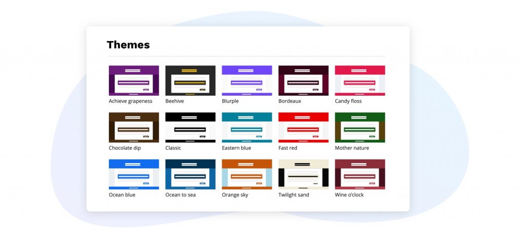
1. Starter themes
You may have an idea for how you want your event page to look but are uncertain of how to achieve it. Perhaps you want your event page to be bright and full of color that pops because your event focuses on family fun; or maybe your event is about celebrating nature, so you are looking for an earthy palette. You can easily get the design you want by selecting one of the starter themes on the branding page. You can browse through a variety of professionally designed themes and decide what best reflects your event’s style. Whatever direction you are going in, our starter themes can help get you there.

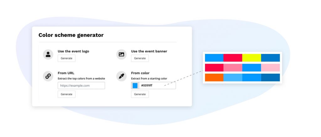
2. Color scheme generator
The color scheme generator is a great tool to use when you already have an existing brand or a vision for your event page in mind. The generator works with your brand colors to help foster design cohesion on all of your event platforms. This consistency makes your brand more memorable, allowing participants to easily recognize your event.
There are multiple ways you can produce a color scheme using the generator:
- Using an image of your event logo – the generator will create a color scheme based off the colors used in your event logo.
- Uploading a banner image – this ensures that the event page is cohesive from top to bottom.
- Entering a website URL – simply put in your website URL to ensure the design is consistent across your different touch points. Alternatively, if there is a website with a design you would like to emulate, you can enter the URL of that site instead.
- Selecting a starting color – generate a color scheme that compliments your starting color.
With so many options, you can easily create a color scheme that best suits your event.

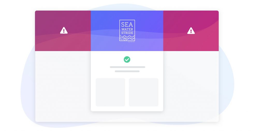
3. Downloadable safe zone template
The banner located at the top of your event details page is an effective design element you can customize to showcase your brand. It can also be utilized to display key information about your event, such as what your event is about, the date, what the distance is, and more. Our safe zone design template indicates the best places to display your important details to ensure they can be seen on any screen size. Simply download the template prior to uploading your banner to double check that your essential information sits inside the safe zone.

4. Ability to show or hide the default banner copy
This tool gives you the ability to either display the title of your event overtop of your banner, or hide the text to showcase your banner image. Since your banner may already have text on it, you are able to hide the overlaying text, allowing your banner copy to shine. The title of your event will then be moved underneath the event logo. Alternatively, if your banner is a simple background image or a solid color, you can display the title of your event front and center, overtop of your background banner.

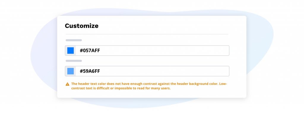
5. Contrast issue alert
We understand it’s important to have an accessible event page, ensuring each participant can easily view all of your event information. If your text color and background color are too similar, this can affect an individual’s ability to read the information, especially for people with a vision disability such as color-blindness. If the contrast between your text and background is insufficient, the contrast issue alert will appear – this will help you ensure that your text will be legible and registering for your event will be simple for everyone.

With all of these easy-to-use customizations available, you’ll have a well-designed event page in no time. If you have a design team or an agency you work with, you can simply give them limited access to the branding page using Race Roster’s director permissions feature.
To get started, visit your event branding page from the event organizer dashboard. As always, if you have any questions, don’t hesitate to resource us!