Behind the scenes | Estimated Read time – 4:04
Here at Race Roster™, we are incredibly passionate about design. Our product team is dedicated to creating a platform that is usable, unified, and designed with your needs in mind. We have been working on building and implementing our own design system, unifying our interfaces through common patterns, visuals, and consistent code. Our design system was built to streamline your workflow and unite the design of the tools you use to continue managing great events with ease.
Meet Race Roster’s design system

If you are unfamiliar with design systems, a design system is a library of website components that can be combined together to build any number of pages within an application. We’ve implemented a design system that will allow us to create a consistent, professional, and cohesive experience throughout the Race Roster platform.
It was important to us to build a design system that enhanced the usability of the platform in different ways:
Consistency across design elements – When an application has consistent call to actions, inputs, user flow (how you navigate through the website), it makes learning the application much faster. It also makes using the application predictable. You know exactly what is going to happen when you click a button. We’re working hard to remove the guesswork to make your job easier.
Accessibility – We take accessibility seriously and recognize that navigating a large application with such a robust feature set can be a hurdle to those who need additional accessible accommodations. By implementing a design system, we can ensure that our components are well designed and well coded to remove as many accessibility barriers as possible. We’ve also taken care in our structural design elements, such as page layouts, toolbars, and more, to make sure that we reduce the cognitive load placed on you, the user. While this may especially help users who may have a cognitive disability, it makes the application more user friendly for all.
Improved code quality and speed of development – Our team has put together a great collection of re-usable website components. We took the time to design and build each of these components really well, making them easy to implement and re-use across multiple sections of the application.
This not only reduces bugs within these components, but it makes building new features much quicker. Additionally, if we discover that a component needs to be adjusted to help make it more usable, we can easily roll this change to all pages from one centralized source.
More pleasing to use – You work hard to make a pleasant experience for your participants. We share that passion and want to make your time spent on our application as delightful as possible. Our design system includes a variety of fun illustrations to help brighten up pages. We use empathetic language wherever possible and have standards for our error messages that make them as helpful as possible.
Mobile friendly – Your ability to manage your business needs to be flexible. Our design system allows all pages to be mobile friendly, making it easier for you to manage your event at any time.
Major recent design improvements

Dashboard page headers
The page headers were updated to allow you to easily view which event you’re working on, breadcrumbs were standardized to allow you to quickly navigate between pages, and a larger emphasis was placed on the page heading so you know where you are within the site.
Adjusting the width of page containers and form elements
In order to make the pages highly legible and work across a variety of screen sizes, we have standardized our page containers and form widths. Form input widths will indicate length of expected content.
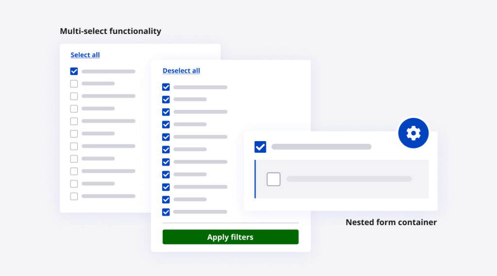
Nested form containers
Form fields that trigger additional form elements have been updated to clearly delineate the form hierarchy. This helps make the relationship between parent form fields and their children evident.
Multi-select enhancements
We added the ability to ‘select all’ and clear form fields, making them easier and quicker to use.
Plans going forward

The product design team is committed to creating an easy to use event management product to help solve event organizer problems. The speed of technological advances in our field keeps us on our toes, so what works today may not work next year. We are always re-evaluating what works and what doesn’t and making the necessary design improvements. We conduct regular user testing to make sure that we are validating all of our design choices and to catch any issues before they reach our live site.
We are keeping up to date on accessibility standards and making adjustments as needed. Race Roster is a living service that changes and matures as we continue to grow our offerings. While change can be difficult, our goal is to make changes that improve your experience on Race Roster.
Please keep an eye out for our next quarterly user experience and design survey! We’d love to incorporate your feedback into our designs.

What’s new at Race Roster?
See all of our releases or visit our what’s new page for the most noteworthy Race Roster updates!